To all number geeks out there, I am going to be honest with you, most of us don’t like trying to work out lines of data and detail in a presentation. We just want to cut to the chase and get straight to the key data insights.
Too many numbers lead to bad memories of stress with Math!
When it comes to numbers, less is more! In fact, it gives us bad memories of the stress we faced during math classes in school.
We are visual creatures!
That’s why graphs or charts are so powerful! They help visualise data and allow an audience to easily identify the SO WHAT.
However, to enable the SO WHAT to be easily identified, we need to understand the different types of graphs and charts that are available and the ideal situations to use them.
Using inappropriate charts or over-using them can easily also lead to confusion. In this post, let’s explore the different types of graphs and charts and when to use them.
Bar Charts
Bar charts are commonly used. You use them when you are trying to display the change in metrics by category.
In the example below, we can easily view the 2019 revenue (metrics) by different companies (category).
Advantages of Bar Charts:
- Commonly used
- Simple and Easy to read and identify differences between categories
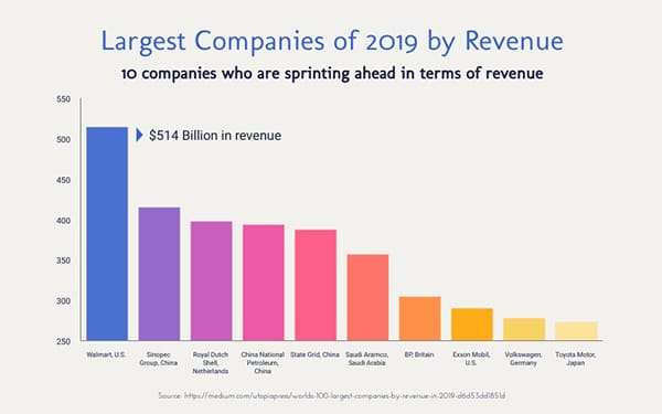
A Bar Charts’ advantage is its simplicity! So don’t overdo it!
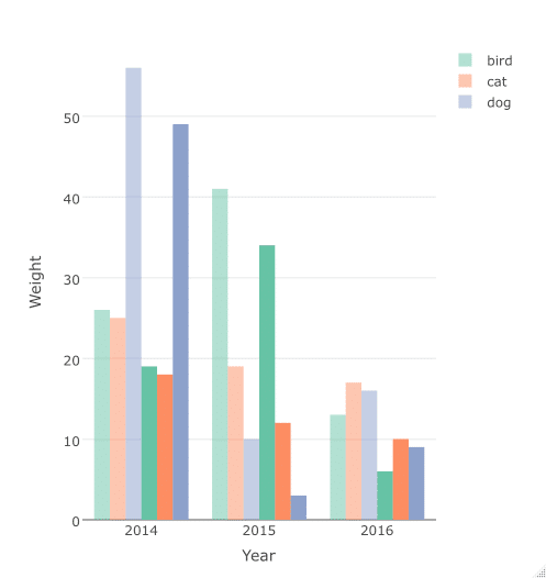
- You can overdo by adding too many categories and sub-categories in your chart – for instance, clustered bar charts can sometimes be hard to read and identify the key insight. See the example below.
Bar charts can be created in Excel. Sometimes, we try to improvise and make it visually appealing. See the youtube video below to find out how to improvise your Excel bar charts or graphs.
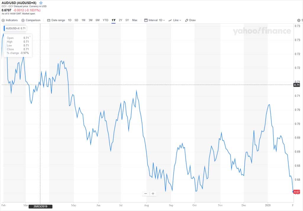
Line Charts
Line charts are used to show trends in data over time. Go to a financial news website and you will likely find a line chart tracking the market index over time. You can use multiple lines in a chart to track the changes in different variables across time.
Advantages of Line Charts:
- Easily identify trends – how data changes over time. Can you identify the trend in the AUD/USD exchange rate line chart below? It’s pretty clear that it has been on the downward trend in the last 12 months!
Things to note about Line Charts:
- Too many overlapping lines on a same chart can make it confusing and distracting
- How you calibrate the X and Y axis of your chart may impact how one interprets the trend
Learn to create a line chart in Excel
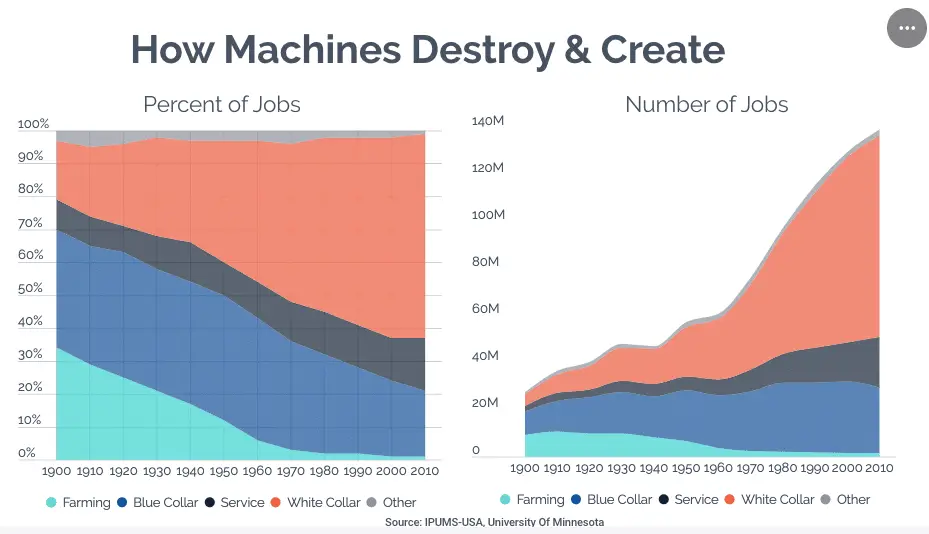
Area Charts
Area charts can be used when you want to display how different parts of your data are changing over time. There are 2 types of area charts: Stacked Area Chart and 100% Stacked Area Chart.
Stacked Area Chart
Stacked area charts are used when you are seeking to show how individual parts of a whole are changing across time
100% Stacked Area Chart
The 100% stacked area chart shows how the percentage share of different parts of a whole change across time.
Learn how to create an Area Chart
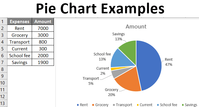
Pie Charts
Another very common chart. The pie chart is used to illustrate sections of a whole. For example, you are shocked that you spent all your month’s salary and would like to know which areas you spent your salary on. The pie chart is a useful visual graph to show which areas made up most of your spending. See the example below.
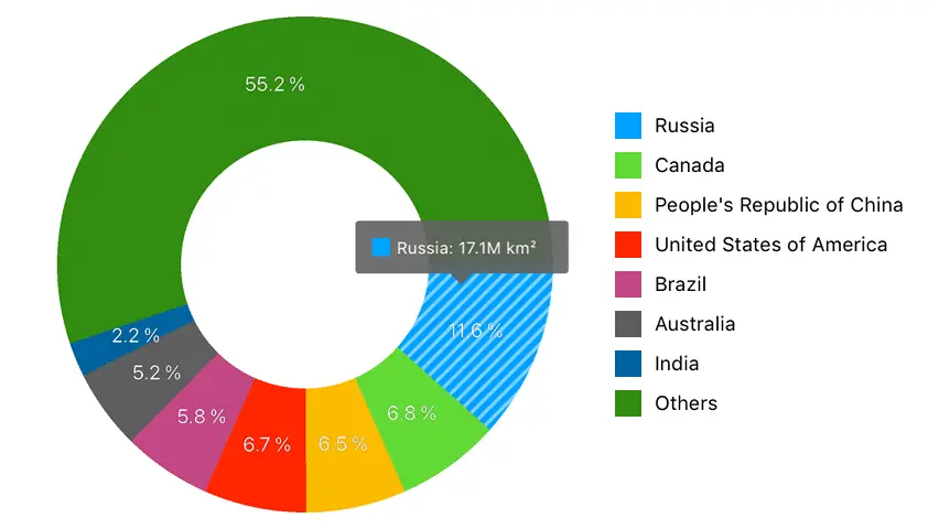
Donut Charts
Similar to Pie Charts but with the centre cut out. The advantage of having the centre cut out is that it allows you to place additional information about the data you are visualising.
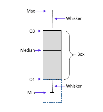
Box and Whiskers Chart
Highly useful chart if you want to simply show how your data is distributed. It shows the 25 percentile, middle point and 75th percentile of your data, allowing you to understand how skewed your data is. This is important especially when averages can something be misleading.
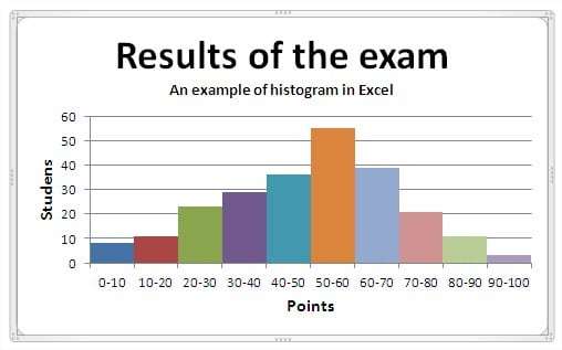
Histogram
Use a histogram if you wish to illustrate the frequency of data by intervals. For example, if you are a teacher and you would like to show the number of students who score in different ranges in an exam, you can use a histogram.
Learn how to create histogram in Excel
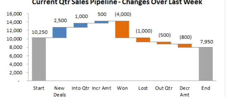
Waterfall
This chart is a favourite of management consultants . The waterfall is also known as a bridging chart. A waterfall visualises the starting point and end point and the different changes that bring you to the end point.
When to use:
- bridge the difference between 2 periods and show the steps that illustrate how the difference occurs
Treemap Chart
Used to illustrate the contribution of categories and sub-categories (hierarchies) to the entire whole. Treemap charts requires categories
Scatterplot chart
Allows one to easily identify patterns or relationship between 2 data sets.

Richard Low
Blogger and publisher of niche websites. Life is not about certainties but probabilities.
Engaged in the continaul search of life hacks that increase one’s edge.
Email me at [email protected]